Accessibility in Digital Design: Beyond Disability
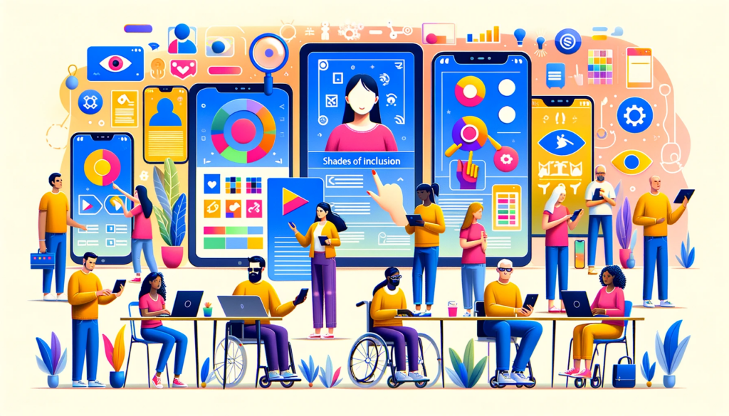
When we talk about accessibility in design, we’re referring to the practice of creating digital experiences that are accessible, understandable, and usable for everyone, including individuals with disabilities. This is about dismantling barriers, not just for a select group, but for all users, irrespective of their physical or cognitive abilities.
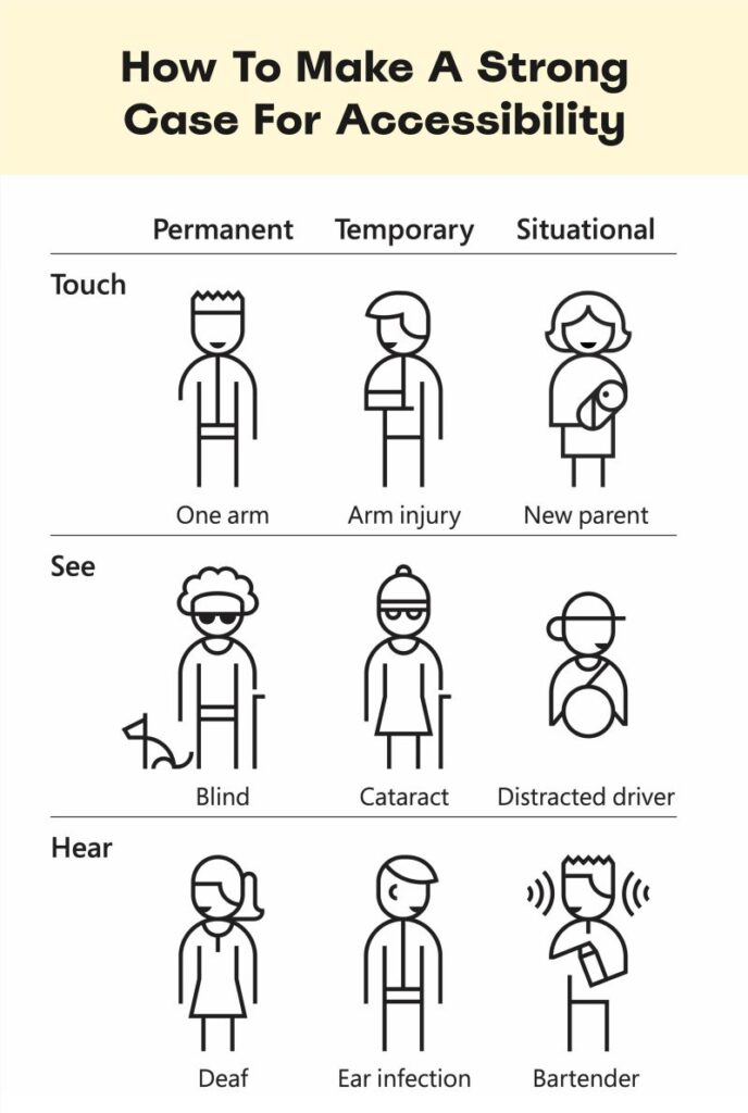
Traditionally, accessibility discussions have been narrowly focused on disability, a term -I deeply despise- which carries certain ableist connotations I’ll explore in a future discussion. However, it’s crucial to understand that accessibility is about inclusivity for the widest possible audience. This includes individuals with ADHD, mobility issues, hearing impairments, or even temporary conditions like a broken arm or eye strain. Essentially, everyone is a potential beneficiary of accessible design.
Expanding the Accessibility Paradigm
Accessibility isn’t limited to addressing the “disability” paradigm. It encompasses several dimensions:
- Physical Accessibility: Ensuring that interacting with a product doesn’t require excessive strength or dexterity.
- Conceptual Accessibility: Making sure that instructions and workflows are intuitive and easy to understand.
- Economic Accessibility: Keeping products affordable.
- Cultural Accessibility: Designing experiences that are sensitive to cultural differences, including metaphors and symbols.
- Social Accessibility: Acknowledging diverse social norms and expectations in product use.
The significance of accessibility cannot be overstated. By making digital experiences inclusive, we enable any individual to fully participate in the digital world. It promotes equal opportunities, empowers users to accomplish their tasks independently, and fosters a sense of belonging and inclusion.
Making digital experiences inclusive isn’t just a nice-to-have; it’s a necessity. Unfortunately, there’s a misconception that accessibility can be tacked on late in the design process. This often results in poor implementations. Accessibility needs to be a core consideration from the very begining of every project, not just an afterthought.
Embracing Standards: The Role of WCAG
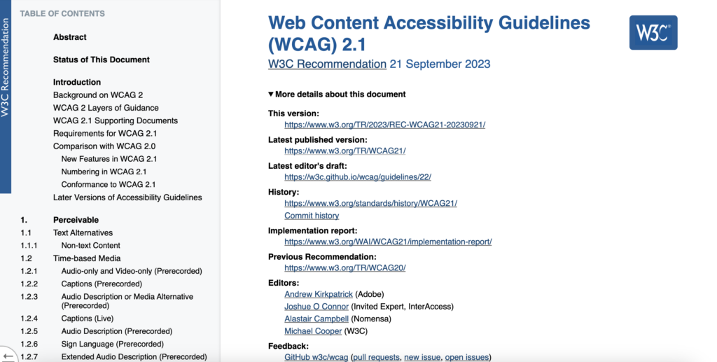
That is why initiatives such as like the Web Content Accessibility Guidelines (WCAG) were born.
However, before we proceed, let me ask you a question: How can this be considered holistically accessible and the main reference in the area?
Sorry but I cannot see their POUR (perceivable, operable, understandable and robust) principles reflected in here:
The Future of Colour Contrast: APCA
Now let’s proceed… Colour and accessibility, right? You can expand on what I will talk about here with this amazing post by Juan Ruitiña.
Meeting the requirements for color contrast is a fundamental aspect of making websites and apps accessible. Users may struggle to differentiate between light colors on a light background due to various factors, such as screen quality, color vision deficiencies, or cataracts.
The WCAG, a leading standard in this field, provides an algorithm to assess if a color combination is accessible. Many designers use this algorithm to guide their color choices, though it has its limitations.
For instance, its simplicity can lead to both false positives and negatives. In the best-case scenario, this could result in a limited color palette; in the worst case, it could lead to less accessible digital products. The forthcoming WCAG 3 aims to improve upon these issues with a new, more sophisticated algorithm named the Accessible Perceptual Contrast Algorithm (APCA).
What sets APCA apart? The current algorithm simply divides the luminance of each color to calculate contrast. APCA, in contrast, takes into account the perceived contrast of relative luminance, considering factors such as:
- The color used for text versus the background, a factor not considered in the WCAG 2 algorithm.
- Text size (font-size) and weight (font-weight: light, regular, bold, etc.). While WCAG 2 differentiates contrast requirements only for “normal” and “large” text (larger than 14pt/18px), with larger text requiring a lower ratio due to its easier perceptibility.
APCA also acknowledges colour combinations that are known to be effective but were previously rejected by WCAG 2, and vice versa. For example, using the WCAG 2 algorithm, black text on an orange background might seem like a good choice. However, there are specific examples of user research like the one conducted by Ericka Seastrand that suggest that white text on an orange background is more perceivable. Here’s a sample comparison:
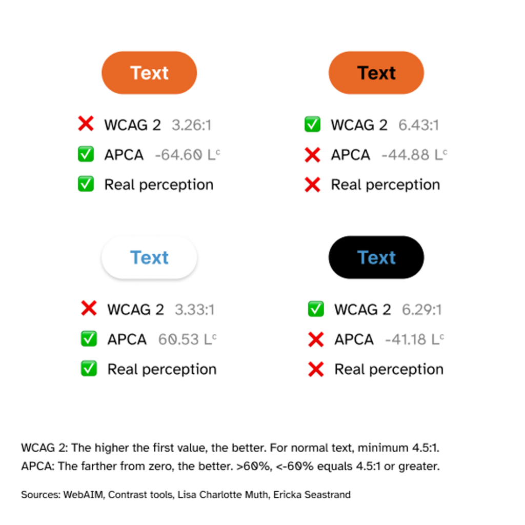
So yes, as you can see APCA is the potential future. Also start forgetting about RGB and CYMK and take a look at LCH as a new approach to scalable colour -too extensive of an issue to expand here now-.
Anyway coming back to accessibility… If you do not to apply accessibility for the users, at least do it to avoid lawsuits. Non-compliance with accessibility standards can result in legal consequences and reputational damage. Failure to make your digital products and websites accessible may lead to lawsuits, complaints, or regulatory actions. You have been warned.
Tools for Enhancing Accessibility
Let’s finish with some tools to make our life a little bit easier and our work a tinny bit more accessible to everyone, shall we?
There are several tools available that allow designers and developers to leverage the Accessible Perceptual Contrast Algorithm, even though WCAG 3 is still in draft form and the algorithm isn’t finalised. These tools can be invaluable for ensuring that your digital products meet the latest accessibility standards. Here are some noteworthy options:
- Myndex’s APCA Tool: A leading tool for implementing APCA guidelines.
- Contrast Tools: Helps visualize the accessibility of different font and color combinations.
Remember, while these tools are extremely helpful, they should be used as part of a broader design and testing process. Always complement automated checks with real user testing, especially with individuals who have varying degrees of visual impairments, to ensure your designs are truly accessible.
Embracing a Future of Inclusive Digital Design
In conclusion, the journey towards truly accessible digital design is both a challenge and an opportunity. It requires us to broaden our understanding of accessibility, moving beyond traditional definitions and embracing a more holistic approach. This journey is not just about adhering to guidelines or avoiding legal pitfalls; it’s about a commitment to creating digital experiences that are genuinely inclusive and empowering for all users.
As designers, we have the power and responsibility to dismantle barriers in the digital realm. Let us remember that every step we take towards more accessible design is a step towards a world where digital experiences are not just available but truly welcoming to everyone. Across this challenge, our creativity, empathy, and innovation are our greatest assets. Together, we can shape a digital landscape that reflects the diversity and dynamism of the world we live in.