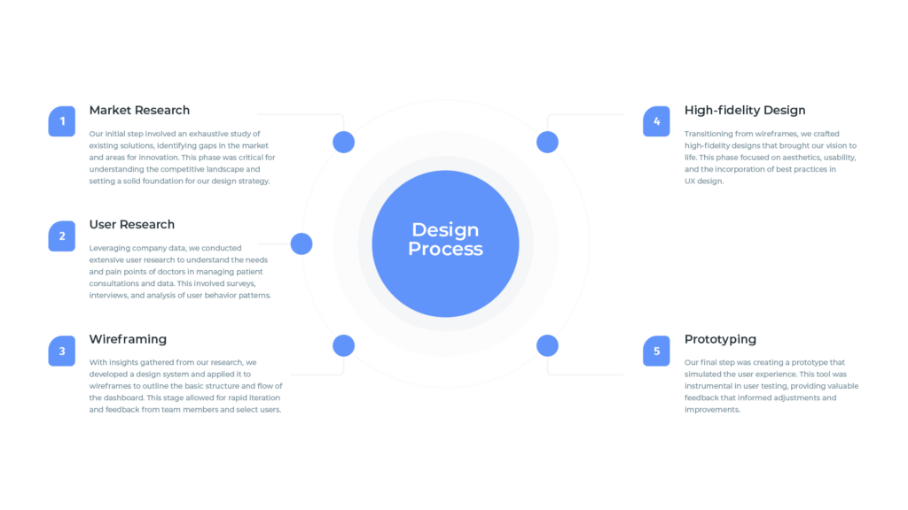
-Market & UX Research
-Design System
-Wireframing
-High-Fidelity Design
-Prototyping
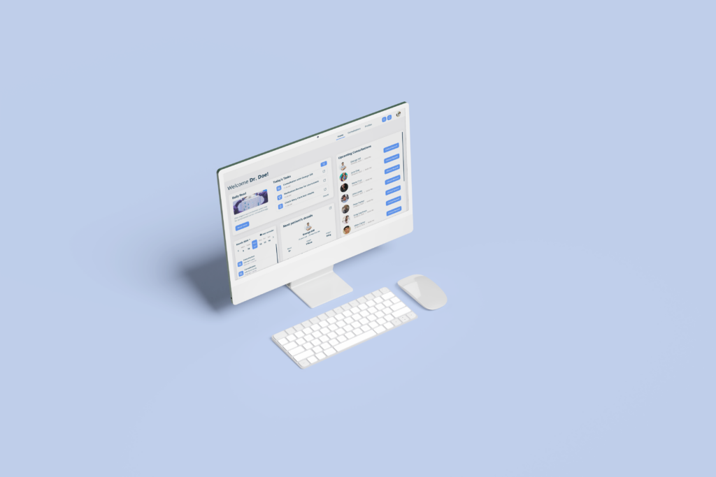
In the rapidly evolving field of healthcare, digital tools that enhance doctor-patient interactions are more crucial than ever. That is why an e-health platform reached me to collaborate with them in turning their vision into reality. Our project, a medical dashboard for doctors, was conceptualized to streamline the management of consultations, patient notes, and data.
Spanning a brisk two months, this project required swift, effective execution to secure necessary funding for production. Our multidisciplinary team comprised the CEO, marketing specialists, a developer, and medical consultants, all driven by a shared goal to enhance healthcare delivery.
The primary challenge was developing a comprehensive solution that addressed the intricacies of medical consultations and data management without compromising on ease of use for healthcare professionals. The project aimed to:

Despite our team’s dedication and the project’s potential, it was ultimately discontinued due to insufficient funding. This was a significant setback, as the prototype had demonstrated promise in improving the efficiency and effectiveness of medical consultations.
The project’s termination, while disappointing, offered invaluable lessons. It highlighted the importance of securing funding and the challenges startups face in the competitive healthcare technology sector. Personally, it reinforced the significance of resilience, adaptability, and the continuous pursuit of innovation in UX design. Reflecting on the project, exploring alternative funding avenues or a phased approach to development might have altered the outcome.
Though the medical dashboard project did not reach its intended conclusion, the experience enriched my understanding of the healthcare industry’s needs and the critical role of UX design in creating solutions that can significantly impact both practitioners and patients. This journey, with its highs and lows, underscores the importance of thorough research, agile development, and the relentless pursuit of innovation in the face of obstacles.
In the spirit of community and continuous learning, I have decided to share some of the project’s screens and UI Kit for free on Figma. My hope is that these resources can serve as a foundation or inspiration for others working on similar challenges within the healthcare sector. By sharing these designs, I aim to contribute to the broader UX and healthcare technology communities, fostering an environment of collaboration and mutual growth.
This case study serves as a testament to the importance of resilience, adaptability, and the pursuit of meaningful solutions in UX design, even when faced with unforeseen challenges.
CLICK HERE to get the Figma File.