Hippi IBZ, a brand synonymous with the free-spirited and artistic lifestyle of Ibiza, approached our team with a distinct vision. They needed an online platform that could beautifully reflect the essence of the island and seamlessly deliver their unique clothing and jewelry products to the world.
-Information Architecture
-Low and High-Fidelity Wireframes
-Design System
-Copywriting
-Branding
My primary challenge was to encapsulate Ibiza's distinctive way of life into a digital format. I aimed to create a website that evoked the island's laid-back charm, celebrated its bohemian artistry, and effectively translated these elements into an immersive user experience.
As UX designer, my journey with Hippi Ibz commenced with an immersive exploration of Ibiza’s vibrant culture. I delved into the lives and stories of the local team, seeking to understand their artisan ways. This empathetic approach became a cornerstone in crafting a website that not only showcases products but serves as a digital embodiment of Ibiza’s spirit.
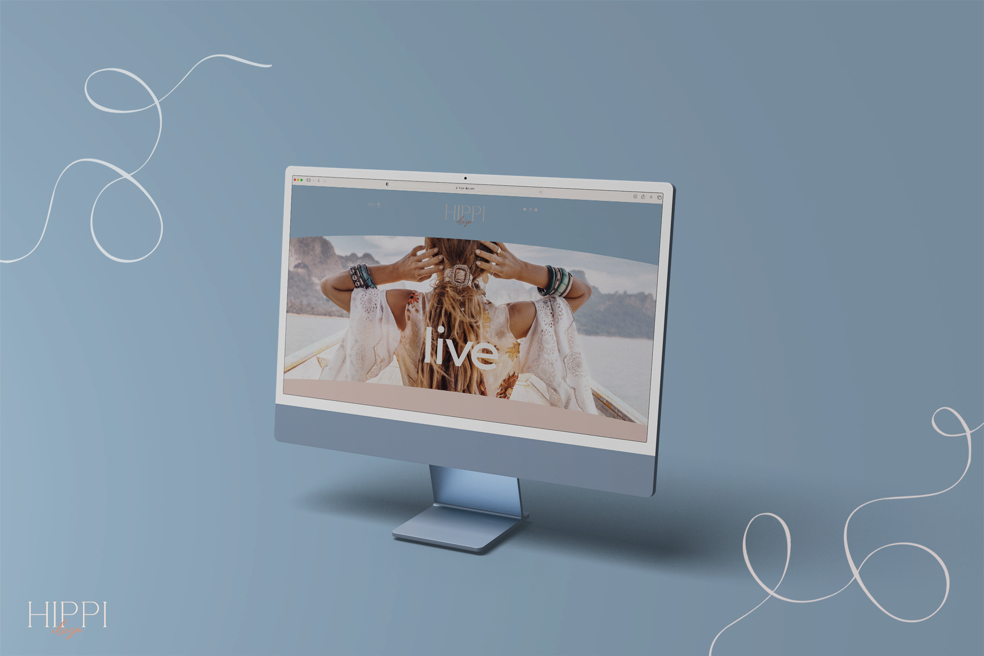
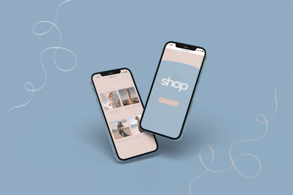
My UX-focused strategy led us to a pivotal decision: rather than conventional product categories, we structured the website around Hippi Ibz’s unique collections, yet also showcase specific new products in the same space. This shift was monumental, as it redefined the user’s journey. I meticulously crafted an intuitive pathway, ensuring that visitors could seamlessly immerse themselves in the free-spirited atmosphere that Ibiza is celebrated for, all while exploring the collections.
This deliberate decision was instrumental in creating a website where aesthetics harmonize with Ibiza’s distinctive charm and artistry. My dedication to user experience was not merely a design choice; it was an unwavering commitment to ensure every visitor experienced the essence of Ibiza during their digital exploration. The resulting website became a testament to the profound impact of prioritizing user-centric design, ultimately leading to a substantial increase in online sales and an authentic reflection of Hippi Ibz’s brand narrative.
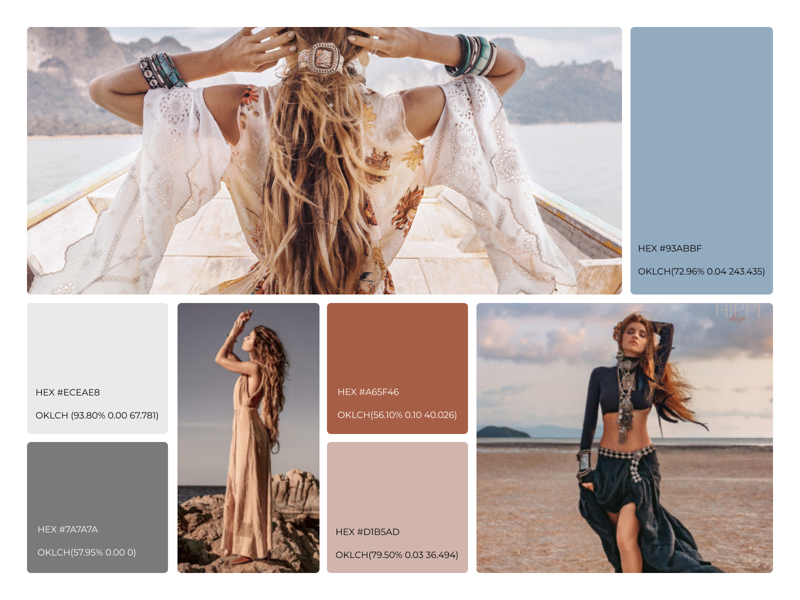
When designing the visual identity for Hippi Ibz, the choice of colors was a critical decision in conveying the brand’s core values and aesthetic. Browns, blues, and greys were selected to symbolize the sky and earth, emphasizing our commitment to natural, grounded elements that resonate with the essence of Ibiza. These colors not only reflect the physical beauty of the island but also align with our brand’s ethos of harmony, sustainability, and authenticity.
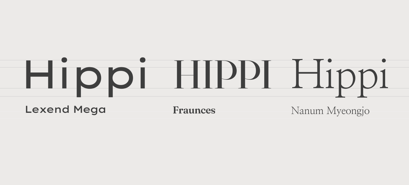
The selection of Lexend Mega, Fraunce, and Nanum Myeongjo is a deliberate choice to reflect the disruptive, free-spirited, and eclectic nature of Hippi Ibz. By combining these three distinct fonts, we create a visual identity that is bold yet sophisticated, modern yet timeless, and above all, true to the bohemian spirit of Ibiza. This typographic strategy not only ensures clear communication and brand recognition but also evokes the emotional and cultural depth that resonates with the target audience. Each font contributes to a layered, multidimensional brand identity that stands out in the competitive online marketplace while staying true to the heart and soul of Ibiza.
Lexend Mega is a modern, highly legible sans-serif font. Its clean and bold lines create a strong visual impact, making it perfect for headlines and key brand messages. The font’s contemporary feel aligns with the modern aspect of our online platform, ensuring clarity and accessibility in digital formats.
Fraunce is a sophisticated serif font that adds a touch of elegance and sophistication to the brand. Its distinct serifs and unique character shapes give it an artisanal quality, reminiscent of handcrafted goods and bespoke designs, aligning perfectly with the bohemian aesthetic of Hippi Ibz.
Nanum Myeongjo is a beautifully balanced serif font with a distinct Eastern influence, adding an exotic and unconventional flair to our typographic palette. Its delicate strokes and harmonious proportions reflect the free-spirited and multicultural essence of Ibiza.
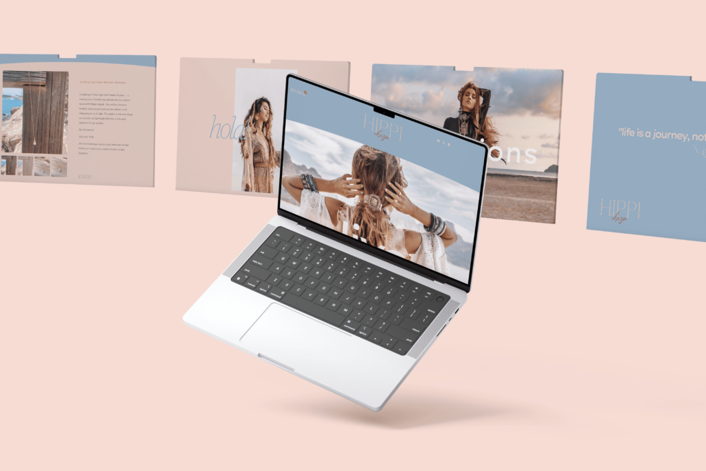
The result was an online platform that captured the very spirit of Ibiza. Users could now embark on a digital journey through the island’s unique lifestyle and effortlessly purchase products that reflected this essence. The project was a success, both in terms of aesthetics and functionality, and Hippi Ibz saw a significant increase (a 35% more) in sales during their first 3 month of implementation.
This project exemplifies our commitment to not just meeting but exceeding our client’s expectations, as we transformed their vision into a user-centric, visually compelling reality that truly encapsulates the heart of Ibiza.