
Overview
The Gov.UK website is often celebrated as a shining example of how government services can be unified under a single digital platform. With the help of the Gov.UK Design System, it has achieved a consistent and accessible user experience across a wide array of government services. But as anyone who’s tried to prove their identity on the platform can tell you, there’s still a chasm between design principles and user satisfaction. This case study delves into the usability issues of Gov.UK, making a case for a more holistic approach to user experience that goes beyond simply following a design system.
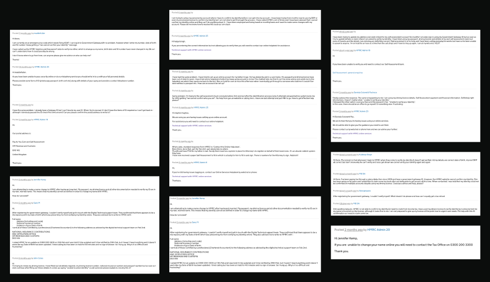
Why am I writing this? Because, after countless frustrating attempts to verify my identity on Gov.UK, I’ve become intimately familiar with the system’s shortcomings. Despite providing all the necessary information, I found myself entangled in a bureaucratic maze, trapped in an endless loop of ineffective support and broken promises. Hours spent on hold with no resolution in sight left me questioning how a platform designed to streamline services could create so many barriers instead. I’m not alone in this struggle—many others have faced similar issues, and that’s what prompted me to critically examine Gov.UK and advocate for a user experience that truly serves everyone.
A truly effective UX design is more than just a set of standards; it’s about creating an experience that is flexible, consistent, and supported at every turn. While the Gov.UK Design System excels at providing standardized, accessible components, these elements must function within a broader, cohesive framework that addresses every user touchpoint.
The current shortcomings of the Gov.UK system—particularly in the identity verification process—highlight a gap between component design and overall user satisfaction. Bridging this gap is essential for transforming Gov.UK into a service that genuinely meets user expectations.
A Brief History: The Gov.UK Project’s Origins and Ambitions
The Gov.UK project was born out of the UK government’s desire to simplify access to its services. Before its launch, government information was scattered across hundreds of websites, each with its own structure, design, and user experience—an expensive, confusing mess for both users and the government. Enter the Government Digital Service (GDS) in 2011, tasked with digitally transforming UK government services. One of its first and most ambitious projects? Consolidating all those websites into a single, user-friendly portal: Gov.UK, which made its debut in 2012.
The goals of the Gov.UK project were as ambitious as they were straightforward:
- Simplification: Centralize access to government services and information, making life easier for users.
- Cost Reduction: Cut down the costs of maintaining multiple websites by standardizing the tech infrastructure.
- Consistency and Usability: Deliver a consistent, intuitive experience across all government services, eliminating the confusion of navigating disparate websites.
- Accessibility: Ensure that all users, including those with disabilities, could access government services.
The Gov.UK Design System: A Beacon of Consistency
As the Gov.UK project matured, the need for a standardized design approach became increasingly evident. The initial consolidation of government websites into Gov.UK created a more unified experience, but challenges related to consistency, usability, and accessibility persisted. Different departments had their own ideas about how to customize their areas of the site, leading to a bit of a design Wild West.
Enter the Gov.UK Design System, launched in 2018, with a mission to corral this chaos. It offers a comprehensive set of guidelines, components, and patterns designed to create consistent, user-centered digital services across the UK government.
The core principles of the Gov.UK Design System are:
- Consistency: All services should use the same components and patterns, ensuring users have a familiar experience, no matter which government service they’re using.
- Accessibility: Every component is designed with accessibility in mind, adhering to WCAG (Web Content Accessibility Guidelines) standards.
- User-Centered Design: The system is informed by user research and testing, ensuring that components are intuitive and meet real user needs.
- Open and Collaborative: The design system is open-source, inviting contributions from the wider design and development community, promoting continuous feedback and improvement.
The Highs and Lows of Implementing the Gov.UK Design System
Rolling out the Gov.UK Design System has been no small feat, involving technical and cultural shifts across numerous government agencies. Here’s a closer look at some of the key challenges:
- Adoption Across Departments: While larger departments with dedicated digital teams adapted quickly, smaller ones struggled, despite extensive documentation and support from the Government Digital Service. The pace of adoption has been uneven, to say the least.
- Customization vs. Standardization: Some government services, particularly those dealing with health, immigration, or taxation, have unique needs that don’t always fit neatly into the standard templates. Balancing the need for consistency with the flexibility to customize has been tricky, and in some cases, the pendulum has swung too far towards inconsistency.
- Accessibility Focus: Accessibility is at the heart of the Gov.UK Design System, but the real-world application has exposed some gaps—especially in complex services like identity verification, where accessibility goes beyond just visual or navigational elements.
- User-Centered Iteration: The design system is a living, breathing entity, constantly evolving based on user feedback. This iterative approach is great in theory, but in practice, it can create challenges in maintaining a unified experience when updates are adopted unevenly across services.
Identity Verification: The Achilles’ Heel of Gov.UK
Despite its many strengths, the Gov.UK platform has some glaring usability issues, particularly around identity verification for foreign nationals. This process is crucial for accessing services like immigration, tax, and social welfare, but it’s riddled with challenges.
- A Complex and Unintuitive Process: The identity verification process is especially tough for foreign nationals. The system often demands documents that are hard to obtain or don’t align with what’s typical in other countries, leading to high failure rates and endless frustration.
- Lack of Support and Transparency: When the system fails (which it often does), users are directed to call support lines that provide little help. With no way to track the status of their verification online, users are left in the dark, leading to prolonged phone calls and mounting frustration.
- Cultural and Contextual Insensitivity: The process seems designed with only UK citizens in mind, without considering the diverse documentation and verification practices of other countries. This results in systemic exclusion, preventing foreign nationals from accessing essential services.
- Inadequate Error Handling and User Feedback: When something goes wrong, users aren’t given clear reasons or guidance on how to fix the issue. Instead, they’re left to guess, often leading to repeated failures and a sense of hopelessness with only a phone number to reach.
These problems reveal a fundamental truth: while the design system ensures visual and interactive consistency, it doesn’t automatically lead to a holistic user experience that addresses the complex needs of all users.
The Case for a Holistic User Experience
The issues with identity verification on Gov.UK highlight the need for a more holistic approach to user experience design. A holistic UX goes beyond the design system, considering the entire user journey and addressing the full spectrum of user needs.
- Understanding User Needs and Contexts: A good design system should be informed by a deep understanding of all users, including those from diverse cultural and geographical backgrounds.
- Clear Communication and User Support: Robust communication mechanisms are crucial, including clear feedback when errors occur and accessible support options.
- Flexible and Adaptive Systems: Design systems need to be flexible enough to accommodate a wide range of scenarios, especially in critical processes like identity verification.
- Continuous Feedback and Iteration: UX doesn’t end at implementation. Ongoing feedback loops are essential for identifying pain points and iterating on the design to improve usability over time.
Conclusion: Beyond the Design System
The Gov.UK Design System is a powerful tool for standardizing and improving the accessibility of government services. However, the usability issues faced by foreign nationals during the identity verification process reveal the limitations of relying solely on a design system to create a positive user experience. A holistic approach to UX, one that goes beyond the design system, is crucial. This approach must consider every aspect of the user journey, ensuring that all users, regardless of their background, can successfully navigate government services.
For Gov.UK, solving these usability issues will require more than just tweaks to the design system—it demands a commitment to understanding and addressing the broader challenges of user experience that lie beyond the interface.