In short
- Challenge
- A dense, growing platform where analysts struggled to see what mattered.
- Approach
- Deep research, then clear hierarchy, a scalable navigation and trusted workflows.
- Result
- 80% fewer rage clicks, stronger engagement and fewer support tickets.
Context
X-Ray is Ebrand’s global platform for detecting, analysing and responding to digital threats: impersonation, phishing, fraudulent domains, dark web activity and data leaks. I lead its UX strategy and end-to-end design.
Analysts, legal teams and expert threat investigators rely on it, sometimes for a routine check and sometimes in the middle of a crisis. When a threat is missed or misjudged, clients face real financial and reputational damage. The interface can’t be the thing that slows them down.
The thread of this story
Fast for analysts, and solid enough to trust.
Analysts need to read a threat in one look, move it forward without friction, and trust that the platform holds up as it keeps growing. Every decision served one of those three: see it, act on it, trust it.
01
See it in one look
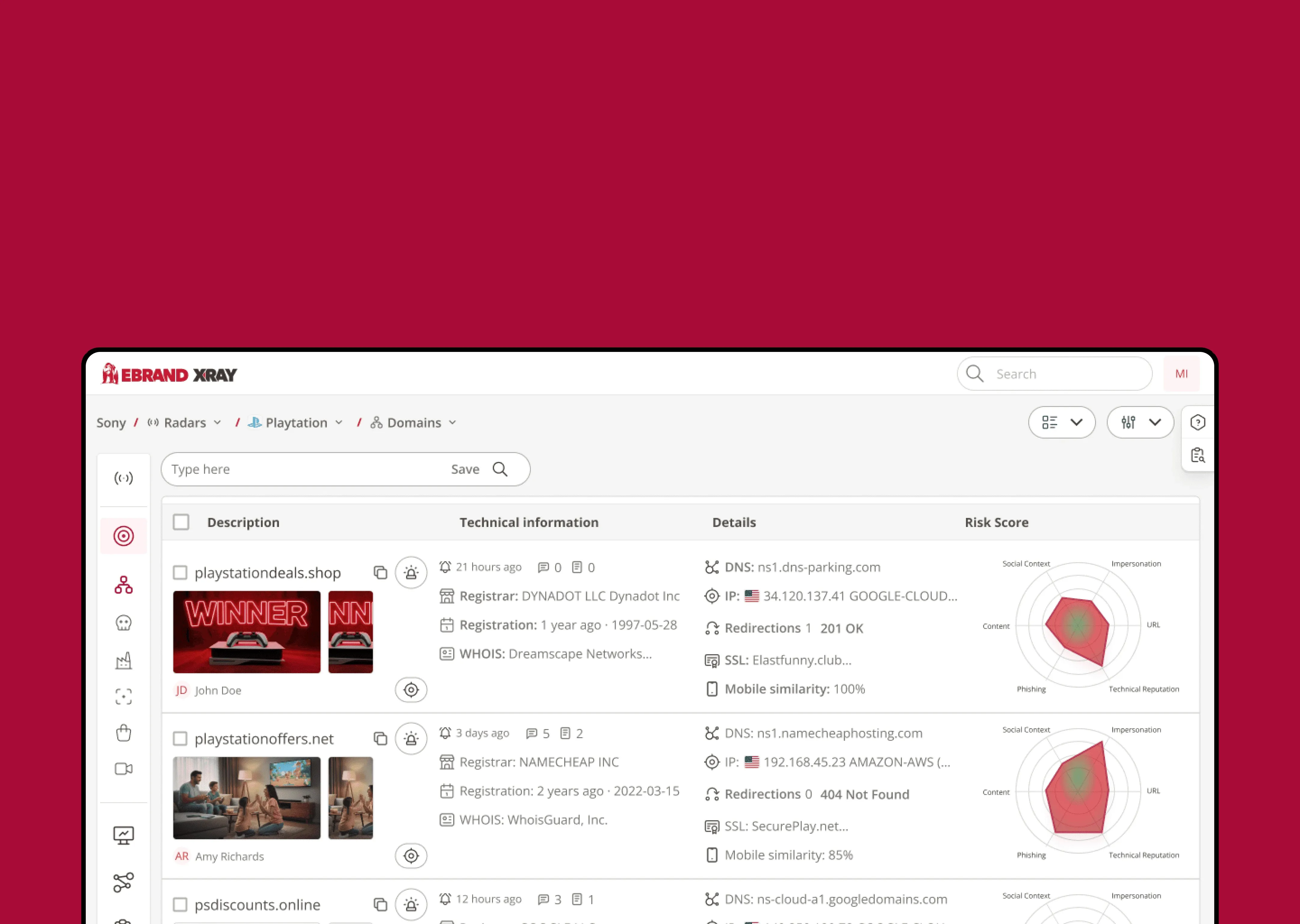
In one year I spoke with more than 20 people: analysts, workshops with the team, and cybersecurity experts beyond it. One insight kept coming back: visual hierarchy is everything. If the most important information doesn’t stand out, nothing else in the design can make up for it.
02
Built to grow
Every new feature made the platform harder to navigate. We designed a whole new navigation system and information architecture with room for what’s coming next, so the product can keep moving fast without getting heavier for the people using it.
03
A flow analysts can trust
Trust is built on predictability. I created clear workflows and a visual language around them, like the detection lifecycle: every threat moves through the same states, shown the same way everywhere. Analysts always know where things stand and what happens next.
The hardest call
I wanted to refresh the whole design system. But in a fast-paced team it would have cost too much time for what it would return. So I let it go, worked within the existing visual language, and put the effort where it counted most.
Refresh the whole design system
Rebuild the architecture and workflows
Outcome
None of this happened in a straight line. The platform kept growing while we redesigned it, so the team learned to adjust as we went: testing early, listening to analysts, and changing course when the evidence told us to.
A new structure only works if people come along with it. We introduced the changes step by step and stayed close to the people using X-Ray every day, so the new way of working felt like help rather than disruption.
It paid off. Rage clicks dropped by 80%, engagement grew across every level of the platform, and support tickets went down. But what I’m proudest of is the team behind it: one that keeps adapting, keeps growing, and makes change feel easy for the people who depend on it.