SaaS · Messaging
Crisp
What if 200,000 businesses stopped being afraid of the settings space?
In short
- Challenge
- A settings space so complex that users were afraid to open it.
- Approach
- Interviews, behaviour tracking and card sorting, then a rebuilt structure with one consistent page pattern.
- Result
- A well-received redesign and years of continued collaboration with Crisp.
Context
Crisp is a customer messaging platform used by around 200,000 businesses, rated 4.7 on the App Store. As it grew, its settings space grew with it, and configuring the product got harder than it should be.
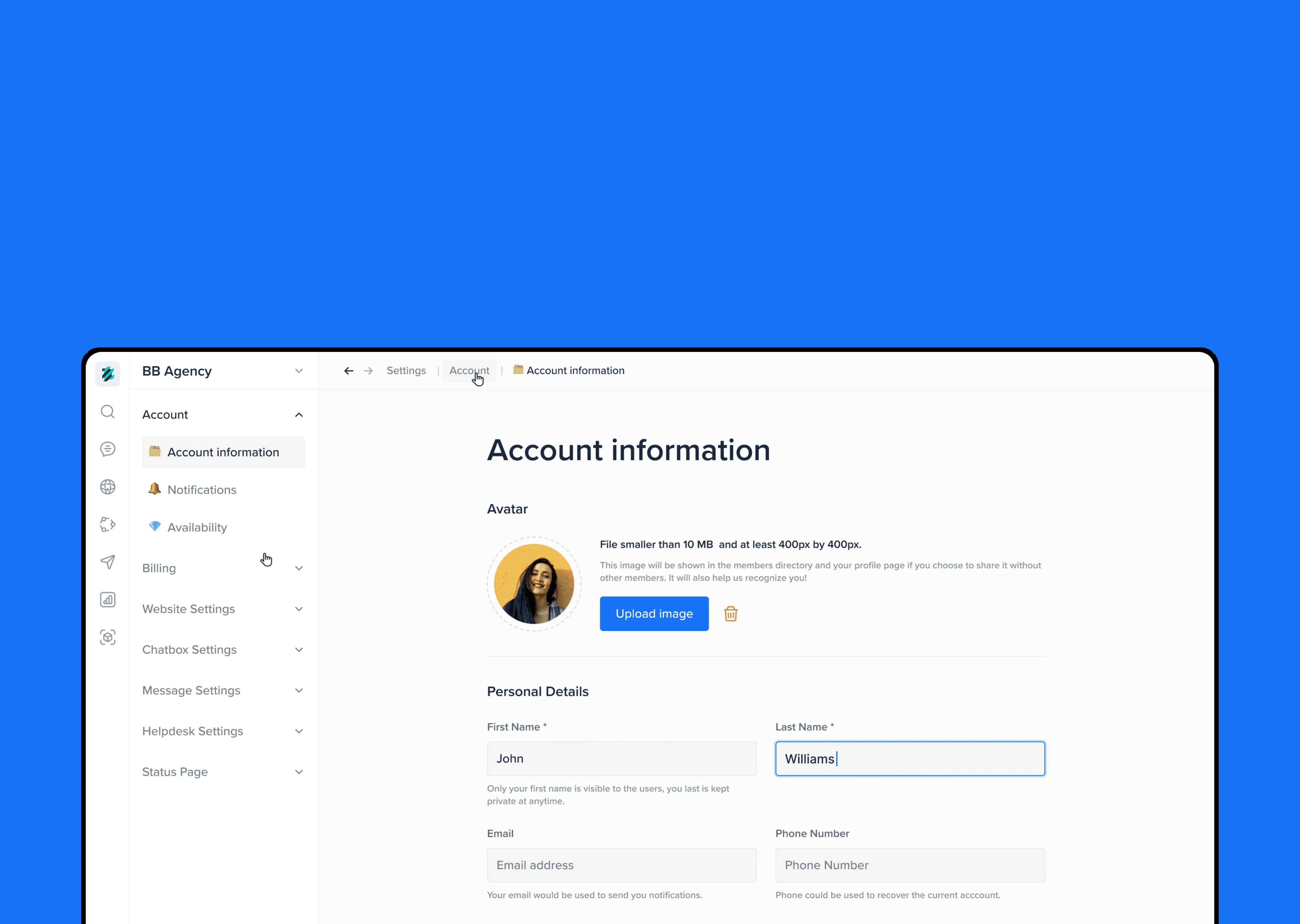
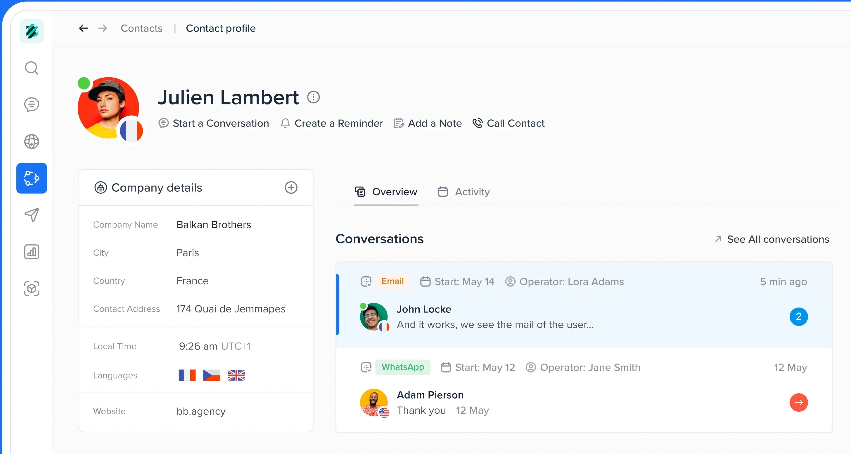
Crisp teamed up with BB Agency for a strategic redesign. As UX Designer, I started with the settings, then moved on to the profile, the filters and finally the onboarding experience. This story follows where it all began: the settings.







The thread of this story
“I’m afraid of getting there.”
From afraid to confident.
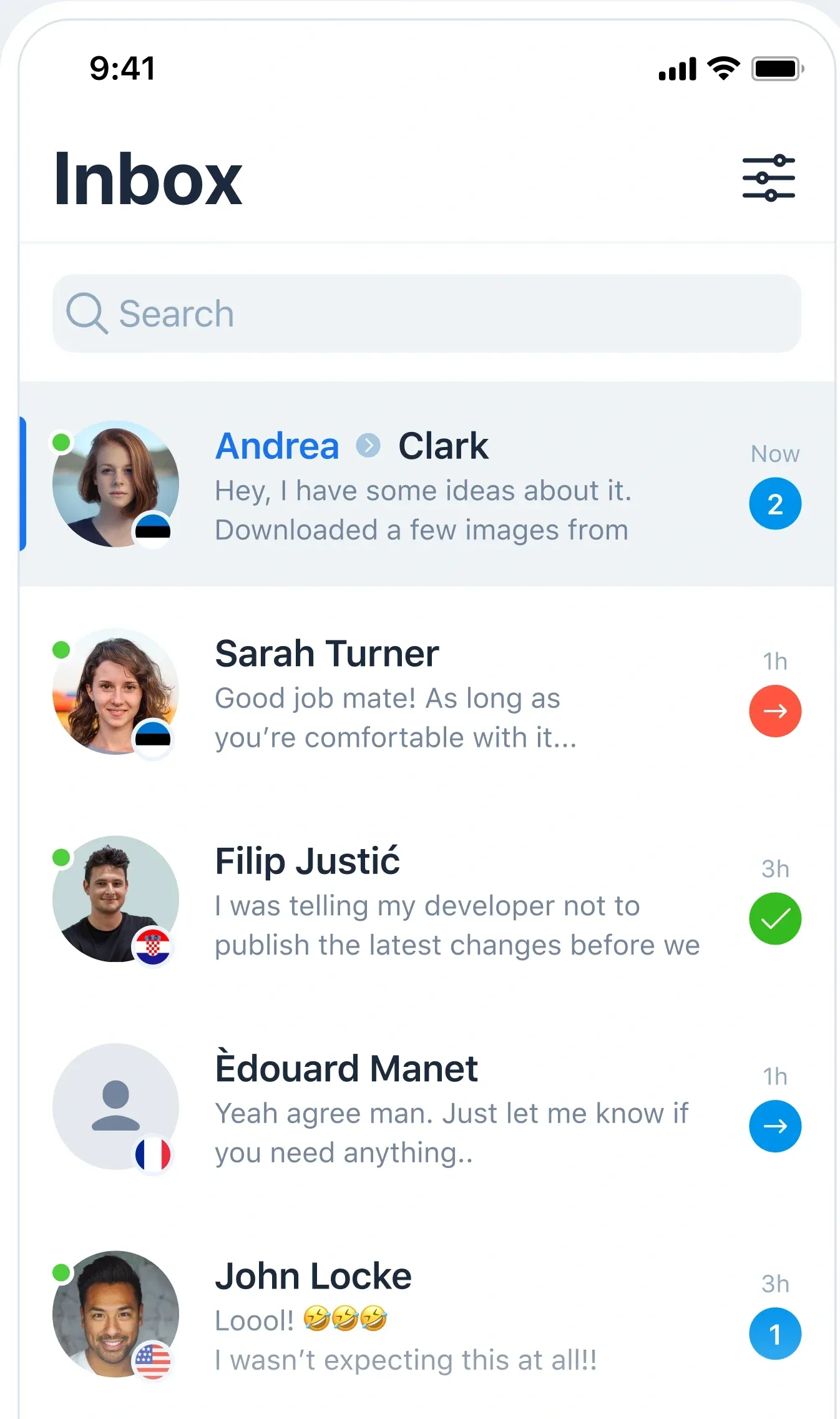
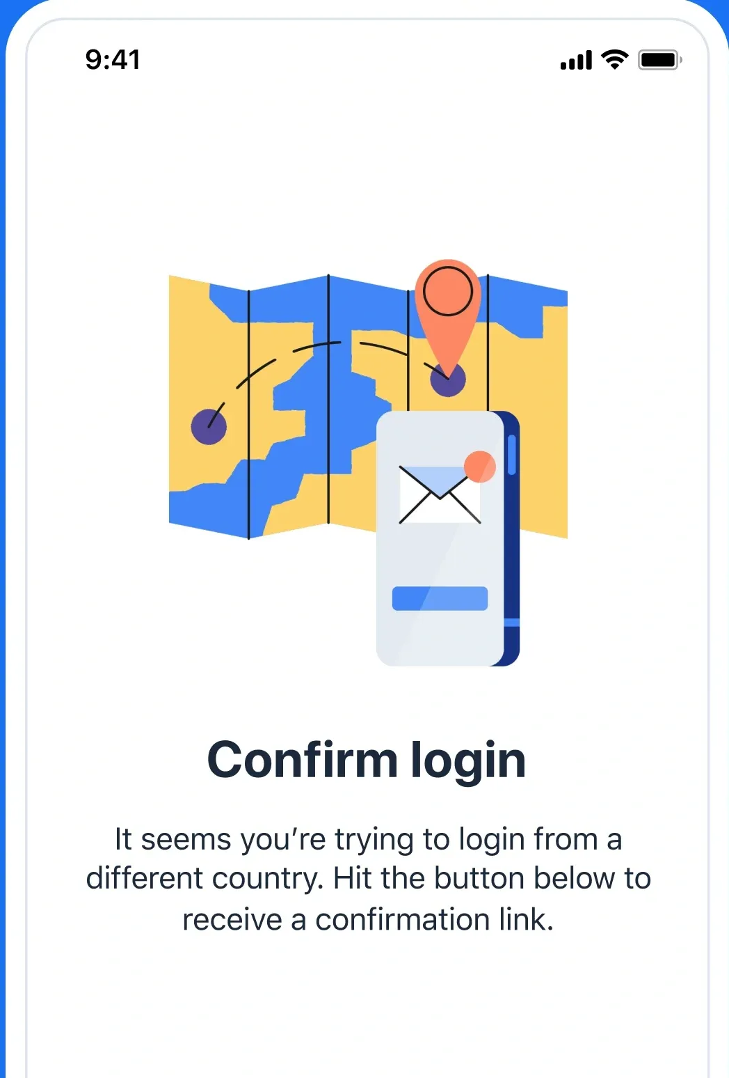
That’s how one user described opening settings. It’s where you go when something needs to change, so if people avoid it, the product quietly stops fitting them. Every decision aimed at one feeling:walking in and knowing where to go.
01
Listen first
I ran many user interviews and studied how people actually moved through settings, where they hesitated and where they gave up. Then card sorting showed how users group things in their own minds.
02
Find it in seconds
We rebuilt the information architecture around those groups, so every setting lives where people expect it. Then we refined it with the team over several rounds, until the structure felt obvious.
03
One calm pattern
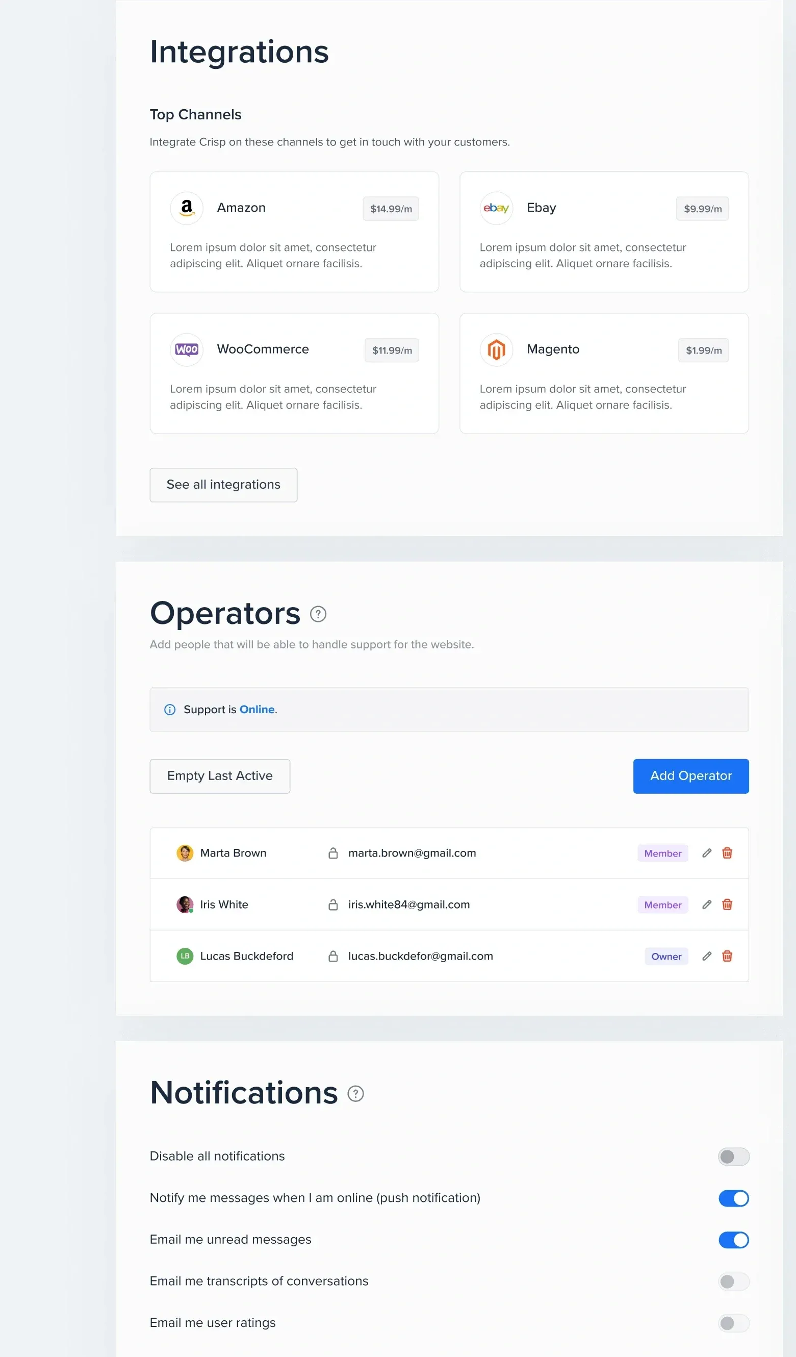
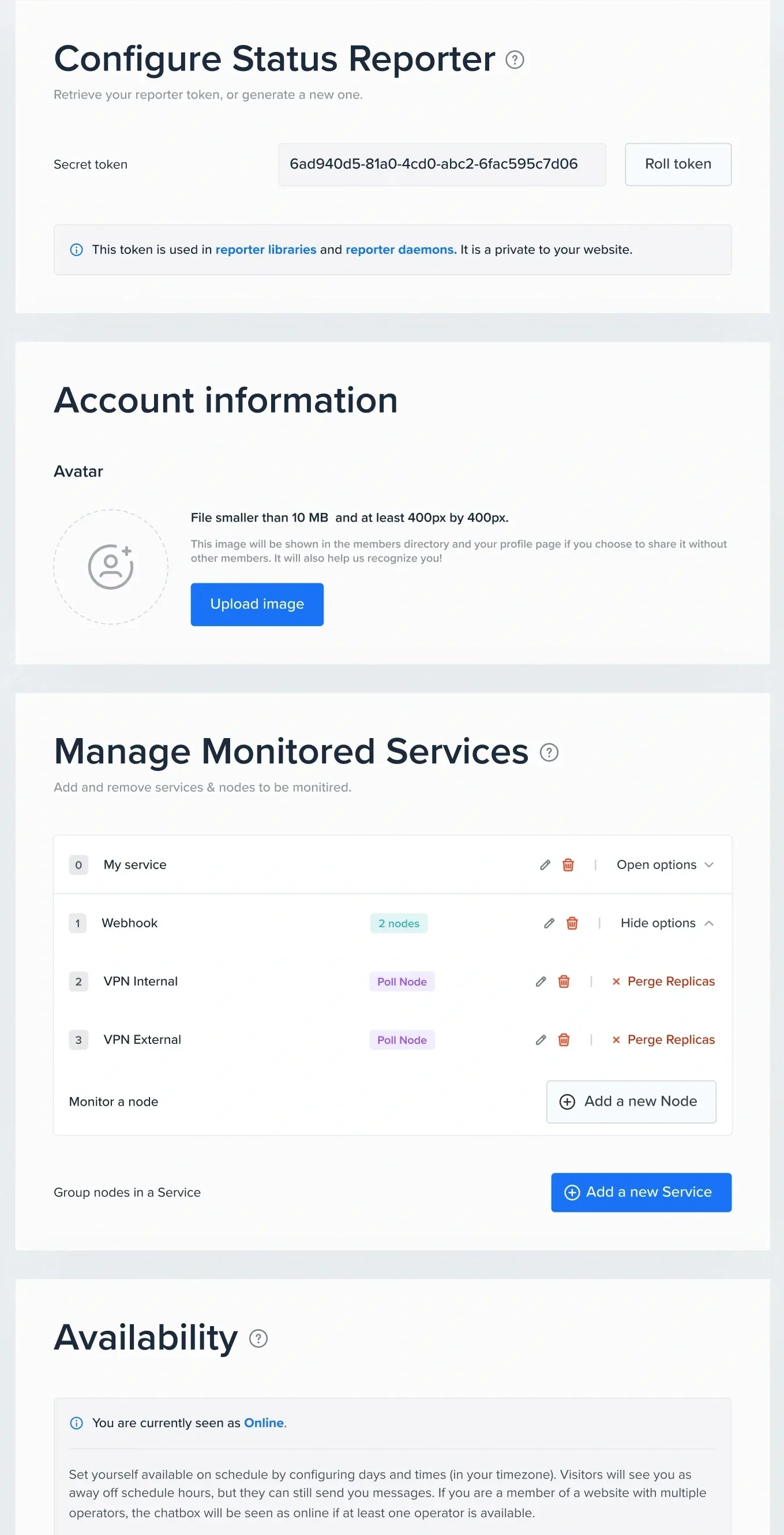
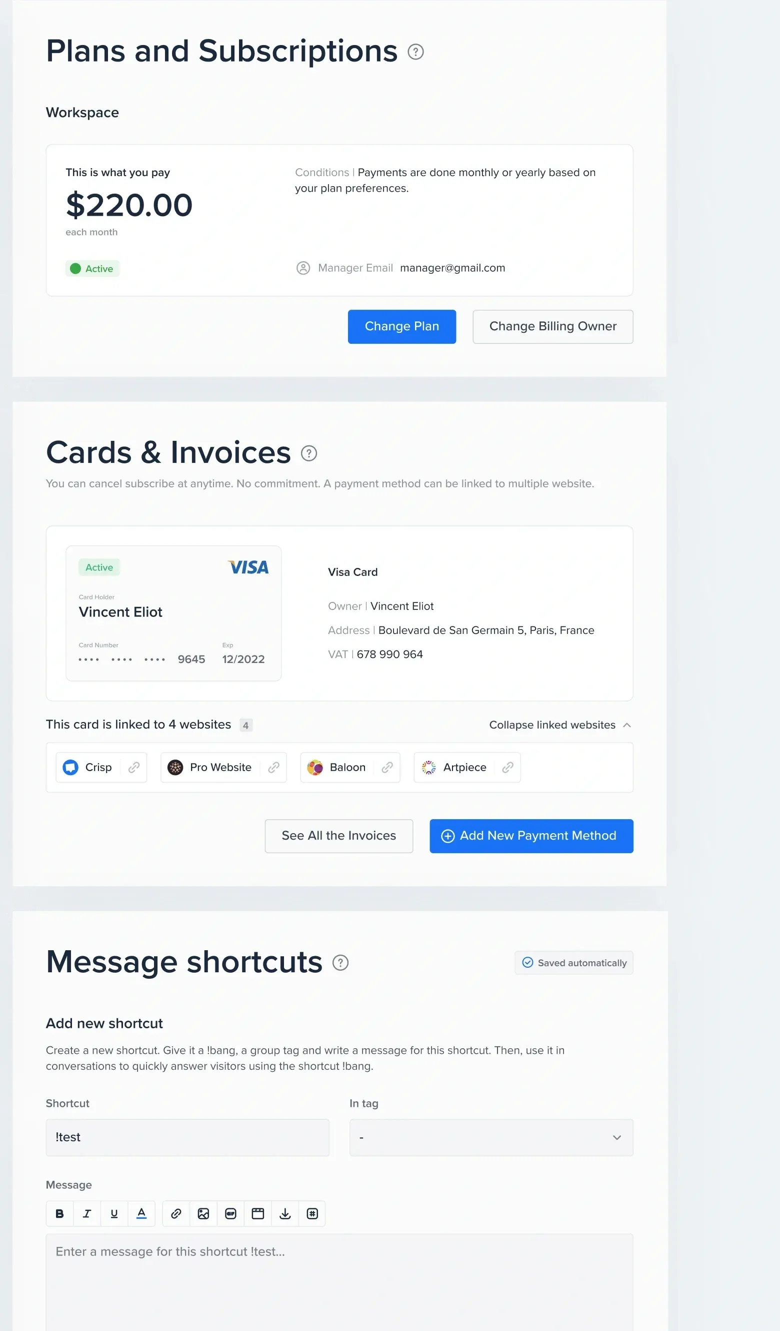
Every settings page follows the same layout, so once you’ve learned one, you know them all. We streamlined the key flows, removed steps and dead ends, and decluttered each page. The pattern scales as Crisp adds features.
Outcome
The redesign was well received by Crisp and its users, and our collaboration with Crisp continued for many years.